Category: Web Design

  • Local Business Website Mistakes I Keep Seeing (And What They Tell Us)

    Local Business Website Mistakes I Keep Seeing (And What They Tell Us)

    Over the past few years I’ve looked at a lot of local business websites. Sometimes properly, sometimes just critically as I browse, and more than once while deciding whether a business was one I could actually help.

    Different trades, different towns, wildly different sizes. Cleaners, care companies, builders, right up to businesses doing very well for themselves. And the strange thing is how often the same handful of problems shows up, no matter who I’m looking at. This post is about those problems, the ones I see again and again and, more importantly, what they quietly tell a customer. Here are some of the most common local business website mistakes, and how to avoid them.

    Most of these sites aren’t bad, they’re just stuck

    Here’s the pattern underneath almost all of it: the website feels like it was built for the business when it was smaller, and it never moved on from there. Nobody’s taken a real strategic look at it since. Nobody’s asked what information actually needs to be on it, or whether it still reflects who the business is now.

    Usually it isn’t laziness. When a lot of these sites were built, the owner didn’t know where to start and it was all new to them. They didn’t have the right help at the beginning, or they weren’t in a position to pay for it back then. So they got something up, it did a job, and the years rolled on. The website might not be awful, it just wasn’t built strategically.

    Let me show you what sticks with me most and then the wider pattern it belongs to.

    The five cleaners and the one photo

    I was once looking at local cleaning companies – five of them. Three were using the exact same photo. Not similar. The same stock image.

    You can picture how it happened: someone went to a stock photo site, typed in “cleaner,” and picked the first result. (And to be fair, it may not have been the owner at all – it was quite possibly whoever they paid to build the site.) Here’s why it matters, and it’s got nothing to do with the photo being ugly. Think about how a customer chooses a cleaner. They’ve never used you and they can’t inspect your work before they book. So they judge you on the one thing they can see – your website. The care you’ve taken there is read as the care you’ll take in their home.

    So when someone lands on a site with a first-result stock photo they’ve half-seen on two other companies’ sites, the unconscious thought is this: you assume you shouldn’t rely on them to do a good job. That’s a lot to hang on one image, but that’s exactly the point – these small signals add up, and the customer is adding them up whether they mean to or not.

    It’s rarely just one thing

    That cleaner’s photo never travels alone. Once you start looking at a site the way a customer does, you notice the rest, and every one of them is saying something. The logo’s gone a bit blurry, because it was saved at the wrong size. It’s the very first thing a visitor sees, and it’s fuzzy. The images are enormous and unoptimised, so the page takes an age to load and a lot of people won’t wait; they’ll be gone before they’ve read a word. (Google notices slow sites too, which is a whole other cost.) There are animations firing off everywhere, added for no reason other than that someone could, when all they really do is get in the way.

    Then there’s the content. A blog with three posts on it, the most recent from two years ago which quietly makes a visitor wonder whether the business is even still going, or still cares. Copy that reads like you’re being talked at down the pub, rather than spoken to by someone you’re about to trust with real work. Pages still carrying the placeholder text that came with the template, never swapped out. Information that’s plainly out of date, sometimes with a little date stamp at the bottom giving the game away.

    And the big one, underneath all of it: sites that don’t actually answer the questions the customer turned up with. They talk about the business, not the person reading. Do you cover my area? Roughly what do you cost? Can I trust you in my home? If the site doesn’t say, the visitor usually doesn’t email to find out – they click back and try the next result instead. Oh, and far too many of these still fall apart the moment you open them on a phone. Which is where most people are looking in the first place.

    Individually, each of these is minor. You could shrug any one of them off. But they don’t come one at a time, they arrive in threes and fours, and together they tell the same story the cleaner’s photo was telling: no one has taken a proper look at this in a long time.

    What about the businesses who are doing fine?

    You might be reading this thinking of a bigger local business with a perfectly decent website. Fair. Plenty of successful businesses have a site that looks the part – they found other ways to grow, and good for them. But looking the part and pulling its weight aren’t the same thing, and a decent-but-unstrategic site is a lever they’re leaving untouched. That’s a whole post of its own, so I’ll leave it there for now.

    What it all tells us

    Here’s the thing I keep coming back to. In all the years I’ve been looking at these sites, I’ve never once seen a business pulling significantly ahead of a competitor who’s putting the work in, while doing nothing themselves. Not once.

    The businesses winning locally aren’t luckier. They don’t necessarily have bigger budgets. They just took their website seriously, treated it as something that needs attention and a bit of strategy, rather than a thing they ticked off years ago. Which is oddly good news. If the gap were about money or luck, there’d be nothing you could do. But effort and strategy? That’s closable. Anyone can start.

    So here’s what I’d do

    Go and look at your own website. Right now, before you close this tab. Look at it the way a customer would – someone who’s never met you and is deciding whether to trust you. Is the logo crisp? Do the photos look like you, or like a stock library anyone could have pulled? Does it load quickly on your phone? Does it actually answer the questions someone would arrive with? And when did you last update any of it?

    You’ll probably spot one or two of these tells straight away. That’s not a reason to feel bad, it’s the first strategic look the site has had in a long time. And that’s exactly where it starts.

    If you’d like a second pair of eyes on your website, that’s what a Digital Presence Assessment is for.

  • Marketing and Technology: The Gap Costing You Customers

    Marketing and Technology: The Gap Costing You Customers

    I see it again and again, just how tightly marketing and technology are now bound together.

    You have marketers with a genuinely great eye, strong on design, strong on the creative side but who are just missing the technical skills to land it – and it shows. You can see there was a vision there, but the final result has flaws, because they couldn’t quite use the technology to implement what they’d pictured.

    So I felt a quiet nod of recognition reading Business Insider’s list of the most innovative marketing leaders of 2026. The piece argues that traditional marketing is now only a sliver of the job and that today’s best marketers are “part brand-builder, part data scientist… part AI wrangler.” One of them, Comcast’s marketing chief, put it plainly: marketing used to be one or two dimensional, and now you “increasingly have to become more of a technologist… to really drive the business.”

    I completely agree. The marketers who understand the link between marketing and technology can reach more people, to present a better image when they do reach them, and to make the whole customer experience more seamless. They can also turn it on themselves: working more efficiently, producing more, at higher quality.

    Which is all true at the top end of the market. But here’s the thing nobody in that article is talking about: what any of this means if you’re not a multinational organisation. If you’re a local trades company, an accountant, a two-person business doing good work that nobody can see.

    You don’t need to be seen seven times. You need to be seen once, and not blow it.

    Marketing people love to talk about touchpoints. The “rule of seven” is the idea that someone needs to come across you about seven times, across different platforms, before they’ll buy. It’s not wrong exactly, but it assumes something most businesses don’t have: enough reach for those seven encounters to even happen.

    For most businesses, the problem isn’t being seen seven times. It’s being seen at all, and then what happens in the few seconds after.

    Picture a local trades company or accountant. You search, you find them, you click the website and you’re taken back to the beginning of the internet. You’re not sure what they actually do for their customers, or how the process works, or whether you’d get a rough price before committing to anything. If you’re honest, you’re not even sure they’re still trading. And the site is harsh enough that you don’t feel comfortable making contact. It reminds you of someone sitting behind it who doesn’t really care about you.

    So you click away and go and find someone else.

    You end up contacting the company that gave you the most information upfront. The one that answered your questions and your worries before you’d even made contact. They felt modern, professional and inviting. They felt like they wanted your custom and would do whatever they could to help. The whole thing already felt simple, because you understood how it would work.

    The first business owner has no idea any of this happened. They don’t know they lost your attention, and your sale, because they never spent the time to stay current or think about their customer.

    And here’s the part that should sting a little: this should be an obvious, ongoing focus. The website and the customer experience should be constant considerations. But most haven’t touched anything in ten years. They don’t even need to commit to some relentless effort – even an occasional spruce-up and modernisation would transform how their customers feel about them.

    The fix is smaller than they fear and bigger than they think

    So what would I actually have them do?

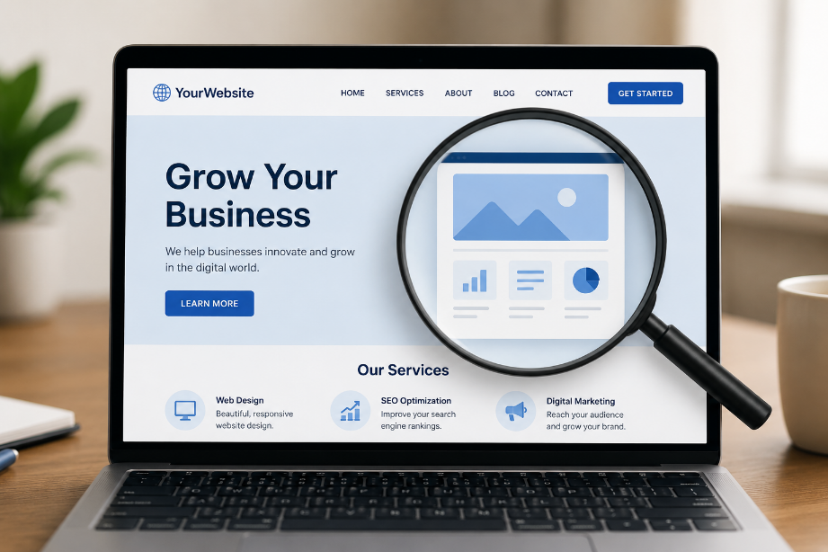
    The bare minimum is to look at the website they already have and ask one honest question: how does this come across to a complete stranger? Then fix what’s broken and change whatever’s giving the wrong impression.

    In truth, most of these businesses do need a new site. But that doesn’t have to be expensive, especially set against how much they’re losing by leaving it as it is. A basic starter site is £550 and in the grand scheme of things, that’s an immediate leg up, not a luxury.

    That’s the visible half, but what actually happens when someone fills in your contact form? Do they get anything back? A bare email dropping into an inbox somewhere or a proper thank-you, maybe with a useful piece of content that starts answering their questions while they wait?

    What happens when someone messages you on Instagram or Facebook? Do they sit there for days, the message left unread, wondering if anyone’s home? Or does something reply within five minutes, letting them know they’ve been heard and pointing them to what they need?

    That gap matters more than it looks. Replying to an enquiry within five minutes instead of thirty makes you roughly a hundred times more likely to actually reach that person (MIT/InsideSales, 2007). When you’re busy doing the actual work, you can’t be that fast by hand. But technology can in the background, while you get on with the job. Setting that up is exactly the kind of automation we help businesses put in place.

    Not sure if this is you?

    If you’ve read this far and you’re wondering whether any of this applies to you, there’s a good chance that, deep down, you already know it does. The honest blockers are usually one of three: you’re not sure where to start, you’re worried about the cost, or you’ve never really believed this stuff was a priority.

    If that’s you, that’s exactly what a Digital Presence Assessment is for. It’s free. We look at where you stand and tell you where to focus. Where your time and effort will actually move the needle on being found online and turning that into enquiries. No big rebuild to begin with. Just an honest picture of where you’re losing people, and what to fix first.
  • Most web designers ask the wrong first question

    Most web designers ask the wrong first question

    For about a decade, I worked in technology, and a particular kind of phone call came in again and again. Someone would ring, having already worked out exactly what was wrong and exactly what I needed to do to fix it. “The service is slow and you need to sort out the servers.”

    The unfortunate truth is that the people who called like that were almost always wrong. The service wasn’t slow because of the servers. It was slow because of their own internet connection. If I’d simply done what I was told, I’d have spent time and their money fixing something that was never broken and the real problem would still be sitting there.

    So I learned to do the opposite of what was asked. Instead of jumping to the fix they’d named, I’d go back to step one and work carefully through each part of the problem until I found the actual cause. Only then could I recommend the right solution. Not the solution they walked in with but the one that would actually work.

    That methodology is the single most important thing I brought with me into web design. And it’s why I think most websites disappoint the people who paid for them.

    So, do I need a new website?

    Quite possibly, yes. I’m not going to talk you out of one. A website that genuinely works for your business is one of the best investments you can make, and small differences, done well, add up to a big one.

    But here’s the thing. “I need a new website” is a diagnosis, the same as “you need to fix the servers.” It’s a fix someone has landed on, usually because the current site feels dated, or it isn’t bringing in enquiries, or it just doesn’t feel like them anymore. Those are real and valid frustrations. The problem is that “make it look nicer” treats the symptom, and a brand-new website built to that brief will look lovely and still fail to do its job – which is exactly the experience that left so many business owners feeling burned by their last one.

    A website that disappoints almost always traces back to the same missing step: nobody did the strategy work first.

    Why we’re all a bit blind to our own business

    There’s a reason this is so hard to see from the inside, and it’s not a failing, it’s human.

    When you run a business, it’s on your mind every single day. You know it inside out. And because you understand it so completely, you naturally assume everyone else does too. You feel like you only need to say something once for it to land. In reality, the people you’re trying to reach are coming to you cold, and you have to explain yourself clearly, more than once, in language that makes sense to them, not to you.

    This is where an outsider earns their keep. I don’t know your business better than you do; you always will. But I get to see it through the eyes of the people you’re actually trying to win over – the ones who don’t already understand you. Put your knowledge of the business together with that honest outside view, work through it collaboratively, and you get something neither of us would have reached alone. That’s the whole point of starting with strategy rather than design.

    What that looks like in practice

    A care provider came to us wanting a fresh look and better photography for their website. A reasonable request – the old site did feel tired.

    But before touching the design, we worked through who the site was actually for. The existing one spoke almost entirely to one audience: the families they care for. Warm, and important. The trouble was that around half of their referrals didn’t come from families at all, they came through local authorities. An entirely different audience, with entirely different needs, and the old site said next to nothing to them. The business knew this perfectly well; it simply hadn’t occurred to anyone that the website needed to say it, because it was so obvious from the inside.

    So before any design happened, we planned the site around who was really reading it. A dedicated route giving local authorities exactly what they need to make a referral. And the family-facing pages rewritten around the real worries and questions a parent has when they’re searching at a frightening time, answering the concerns directly on the page.

    They came asking for imagery and what they actually needed was to stop being invisible to half their customers. They got a genuinely new website out of it, but one built to do a job, not just to look better.

    The question worth asking

    So if you’re wondering whether you need a new website, that’s the right instinct but it’s the wrong first question. The better one is: what is this website actually for, and who really needs to understand it? Answer that properly and the website almost designs itself. Skip it, and you’ve bought a nicer version of the same problem.

    That’s how we plan a website, and it’s why we start every project with the strategy and understanding before a single page is designed.

    If you’d like an honest outside view of your own digital presence, that’s exactly what our free Digital Presence Assessment is for. We’re based in Norfolk and happy to talk it through.
  • Website Health Check: 5 Simple Things to Check Right Now

    Website Health Check: 5 Simple Things to Check Right Now

    Most business owners know their website probably isn’t doing as much for them as it could be. The problem is knowing where to look and what you’re even looking for. A simple website health check can tell you more than you’d think.

    The good news is that you don’t need to be technical to spot the things that quietly hold most websites back. Here are five checks you can do today, in about thirty minutes, that will give you a much better picture of how your business looks to the outside world.

    Start With a Simple Website Health Check

    1. How does your website actually come across?
      Start with the most important check, and the hardest one to do honestly.
      Open your website on your phone, as if you’d just found it through Google. Try to imagine you’ve never been there before. What’s the first impression?
      Does it look professional, or does it look like it was built fifteen years ago? Does the design speak to who your customer actually is? Does the content tell visitors what outcomes you can create for them, or does it just list what you do?This is where most small business websites quietly fall down. There’s been no real thought given to what a potential customer is actually searching for, what they want to know when they land on the page, or how the site is meant to build trust with them. The website exists but it isn’t doing any of the work it should be doing.
      The hard part is that the people who run the business know it too well to see it clearly. You need an outside view.
    2. How fast does your site load?
      This one is easy to check, and it has a much bigger impact than most people realise.
      Go to Google Page Speed Insights, type in your website address, and wait for the results. You’ll get a score and a breakdown of what Google calls “Core Web Vitals” – essentially, how the page performs for a real visitor.
      If your site takes more than three seconds to load on mobile, you’re losing visitors before they’ve even seen what you do. Google also uses these scores as a ranking factor, so a slow site quietly damages your search visibility on top of frustrating your customers.
      Green scores across the board don’t mean you’re finished – they mean you’ve reached the bare minimum that Google expects. But they’re a good place to start, and the issues that come up are often surprisingly straightforward to fix.
    3. Are you using social media properly or just being present?
      Social media is one of the biggest discovery channels for businesses. But most businesses use it badly, in two specific ways.
      The first is posting purely about what they do. Everyone knows plumbers exist. Another Facebook account telling people that yet another plumber exists isn’t doing anything useful. Before you post, ask yourself: is this shareable? Is this interesting to someone scrolling past? If the answer is no, it’s unlikely to lead to followers, visibility, or enquiries.
      The second is inconsistency. A handful of posts from three years ago, then one from last year, then nothing – this looks worse than not posting at all. It signals a business that started something and didn’t follow through. The rule of thumb is simple: either commit to posting regularly, or hold the account name and leave it dormant. The half-effort version actively damages perception.
    4. What do your reviews look like and are you responding to them?
      Reviews are one of the strongest forms of social proof you have. Other people saying good things about your business is always more powerful than anything you can say about yourself.
      A reasonable target for a small local business is around 30 reviews on the platforms that matter most for you. For most businesses that means Google. Google reviews help with both search discoverability and showing up on Maps. If most of your customers come through social media, Facebook reviews matter too.
      Not having reviews isn’t necessarily damaging on its own. But not responding to negative ones is. A professional, calm response to a negative review often does more for your reputation than the negative review itself does to harm it – it shows future customers how you actually handle problems.
    5. Is your website actually a resource or just a brochure?
      This is the one that surprises people most.
      Most small business websites are static. The home page is the same as it was when the site went live. There’s no blog, no guides, nothing being added. From Google’s point of view, the site looks dormant – and it ranks accordingly.
      Regularly publishing useful content does two things at once. It tells Google your site is active and worth ranking. And it turns your website into something genuinely useful – a place people return to, share, and trust.
      There’s a common worry that comes up here: if I write a guide explaining how to do what I do, won’t people just do it themselves instead of paying me? In practice, almost the opposite happens. When someone reads a clear, honest guide on a topic, they usually come away thinking “this is more involved than I thought – I’d rather pay someone who knows what they’re doing.” You’ve demonstrated expertise, they’ve understood the value, and they’re more likely to come to you when they need help.

    The honest reality

    You can do all five of these checks yourself, in less time than it takes to drink a coffee. What’s harder is being honest about what you find. Most business owners are too close to their own business to see it clearly. They know what their site means to them, so they can’t see how it looks to someone discovering it for the first time. That’s exactly what a proper website health check gives you, which is what a free Digital Presence Assessment does. It looks at your business the way a potential customer would – covering your website, your visibility, your reviews, your social presence, and the things you might not even know to check. The assessment is free, and it gives you an outside view of how your business is genuinely perceived online.

    Request your free Digital Presence Assessment

  • Why Your Website Is Costing You Clients (and how to fix it)

    Why Your Website Is Costing You Clients (and how to fix it)

    Imagine walking into a shop that hasn’t been redecorated in ten years. You ask the shopkeeper to help you find something, but they can’t answer your questions properly and it feels like they don’t really care whether you buy anything or not.

    That’s what visiting a lot of small business websites feels like in 2026.

    Not because the business owner doesn’t care. Usually they care deeply. But the website was built quickly, by someone who moved on, and nobody with real technical knowledge has sat down and looked at it properly since.

    I spent a decade in IT infrastructure. When something breaks at 2am on a Saturday, you get the call. That kind of environment teaches you to care about doing things properly the first time, because shortcuts have consequences.

    The thing about a website is that the shortcuts aren’t always obvious. There’s no alarm going off. No error message. The site is just quietly letting you down, day after day, while you’re busy running your business.

    Here’s what I see most often when I look under the hood of a small business website.

    It describes the business instead of speaking to the customer

    Most small business websites are written from the inside out. They explain what the business does, how long they’ve been trading, what services they offer. But a potential customer arriving at your website for the first time has one question: can you help me? If your website can’t answer that quickly and clearly, in their language, about their problem – they’re gone.

    The design undermines the credibility of the business

    Poor quality images. Inconsistent fonts. A layout that looks dated on a desktop and broken on a phone. These things might seem superficial, but perception matters enormously. A customer who doesn’t know you yet is making a judgement call in seconds. If your website looks like it hasn’t been touched since 2014, that’s the impression they’re forming of your business.

    Nobody has thought about the actual customer journey

    I once looked at a business that sold products online but had no way for customers to filter or compare them. The owners knew their range inside out so to them, it all made sense. But a new visitor had to click into every single product page individually just to understand what was available. The owners couldn’t see it because they weren’t the ones experiencing it – but they were losing sales because of it.

    This is one of the most common problems I find – not that the website is broken, but that nobody has ever looked at it through the eyes of a first-time visitor.

    The basics haven’t been set up properly

    No analytics, so there’s no way to know if anyone is even visiting. Contact forms that look fine but send emails straight to spam. A Google Business Profile that’s either missing entirely or showing the wrong address and phone number. An SEO setup that means the site essentially doesn’t exist to anyone searching for what the business offers.

    None of these things are catastrophic on their own. But together, they quietly chip away and the cost isn’t always visible. It shows up as enquiries that never came, customers who chose someone else, and a business that’s working harder than it should have to.


    So what should you do about it?

    Start by trying to see your website the way a stranger would.

    You’re not looking at it as the person who knows every product, every service, every team member. You’re looking at it as someone who found you on Google thirty seconds ago and is trying to work out whether you’re worth their time.

    What do they see? What questions do they have? Can they find answers easily? Does the site make them feel confident, or uncertain?

    If you’re not sure, that’s worth finding out.

    We help UK businesses understand how they’re perceived online, from the outside in. If it would be useful, we can put together a report for you that gives an honest picture of how your business looks to someone discovering it for the first time. It’s free, and if you need any more help from there, we can talk then.

    Get your free Digital Presence Assessment →